October 4, 2026 · 6 minutes
The colours of 2026, and where to actually put them
Every paint company named a colour of the year, and for once they nearly agree. Warm, earthy, a little bit dirty. Here is what that means in a real room.
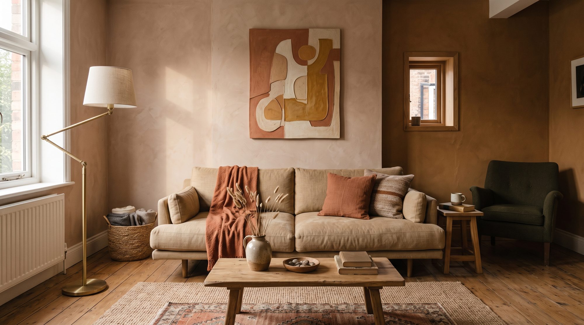
If you looked at the colours of the year all at once this time, you would notice something unusual. They mostly point the same way. Benjamin Moore chose Silhouette, a deep charcoal with plum underneath it. Sherwin Williams chose Universal Khaki, which sits in the gap between beige and taupe with a little green in it. Dunn Edwards went for Midnight Garden, a deep earthy green. Behr picked Hidden Gem, a smoky jade. Graham and Brown chose Divine Damson, a cherry red with violet in it.
Different colours, one idea. Nothing bright. Nothing cold. Everything looks like it came out of the ground rather than off a screen.
Why the whole industry turned warm
The grey years are properly over. For about a decade the safe choice was a cool grey wall, a white kitchen and a pale wood floor, and a lot of houses ended up looking like a showroom nobody lived in. The reaction to that is the palette we have now: clay, caramel, terracotta, wheat, warm greys with brown underneath, and greens that look like a hedge rather than a mint.
There is a practical reason too. Warm colours hold light better in the evening. A cool grey room at seven in the evening under a lamp looks flat and slightly blue. A clay room under the same lamp looks like something.
The three ways people use these colours
The first is the whole room. One warm neutral on every wall, the ceiling included, so there is no line where the colour stops. It sounds bold and it is the safest of the three, because nothing has to match anything. Wheat, khaki, a soft ochre, a warm greige. The room reads as calm and the furniture does the talking.
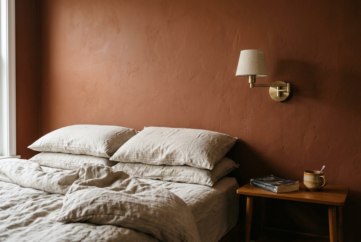
The second is one wall and nothing else. This is the one that goes wrong most often. A single deep wall behind a sofa works when the wall is the one you look at from the doorway, and it fails when it is the wall beside the window, because the light coming past it makes the colour look like a mistake. If you are doing one wall, make it the one facing the way you walk in.
The third is the small amount of something serious. The merlots, oxbloods, plums and deep teals belong here. A whole room in oxblood is a restaurant. A single oxblood chair in a wheat room is a decision.
What pairs with what
Warm neutrals take almost anything, which is the point of them. If you want a rule rather than a feeling: pick one earth, one green and one metal, and stop there.
An earth, meaning clay or caramel or terracotta, as the ground. A green, meaning forest or olive or that smoky jade, in one or two places, usually a chair, a cushion or the inside of a bookcase. A metal, meaning brushed brass, warm bronze or matte black, and whichever one you pick, use it on everything metal in the room. Mixed metals can work, but it takes a confident eye and most rooms where people tried it look like the handles were bought on different days.
The thing nobody tells you about paint
A colour on a card is not the colour on your wall. It changes with the light your room gets, with the floor you have, and with the furniture already in it. A caramel that looks warm in a south facing room can look orange in a north facing one, and the same tin two walls apart can look like two colours.
The old advice is to paint a large square and live with it for a few days, and that is still right. The newer option is to see the colour in a photograph of your own room before you buy anything, which takes a minute instead of a weekend. Either way, do something. Nobody has ever regretted testing a colour, and plenty of people have regretted a whole tin of it.
If you only do one thing
Paint the room you spend the most evenings in, in the warmest neutral you can stand, and then put one deep colour in it on something you can move. A chair, a throw, a lamp. You will learn more about what you actually like from that one chair than from a year of saving pictures.